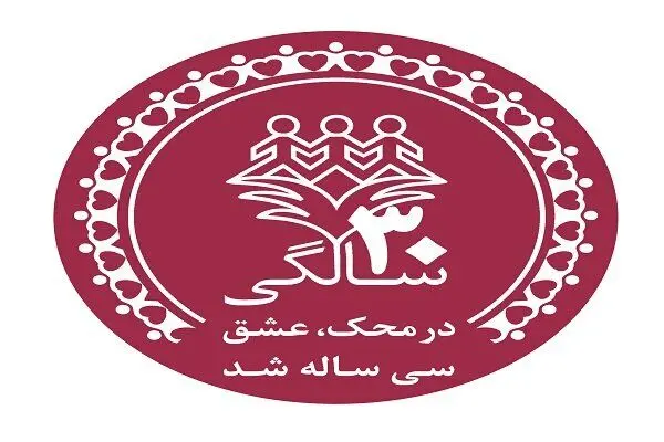
In the 30th year of its operation, MAHAK unveiled its special 30th anniversary logo. Sharif Nezam Mafi, the CEO, asserts that MAHAK's achievements in the past 30 years can be summarized in providing comprehensive support for over 35,000 cancer-stricken children and their families – a feat contributed to the overall trust and engagement of civil society, as well as the help of benevolent volunteers and financial contributors.
The CEO tributes the new logo and explains, "The 30th anniversary logo highlights how a logo should be like; an organization's logo acts as an identity of the brand and can serve as a different element of communication in conveying our message and our long term goals.”
Did you consider this logo change as a redesign?
"There is a difference between redesigning and occasional changes," he said. “The redesign happens when an organization modifies its logo, designs and selects a different model for the future or when it wants to deliver a positive message to its target community and stakeholders. MAHAK's logo acts as part of the identity of this organization and it is still effective and dynamic. The redesign of the logo will be done after MAHAK’s 30th anniversary. It should be noted that such occasional changes will only be possible when a logo is dynamic, therefore the changes in MAHAK’s logo which happen only for one year and on the occasion of its 30th anniversary should not be considered as redesign. In terms of occasional changes in logo, Nezam Mafi named the most popular logo in the world is the Google logo. A simple search indicates that the Google logo has been redesigned four or five times by changing the overall form, font and color with minor tweaks occurring on numerous occasions during the year.
Explaining the rich history behind the occasional changes of MAHAK's logo, he said, "The first visible change of our logo was implemented for our condolence banner stands. In this logo, the concept of mourning, companionship and sympathy were conveyed to the viewer by the leaning head of one of three figures of logo on the shoulders of another one. In 2016, MAHAK changed its logo to celebrate a quarter century of activity. Similarly, at the beginning of the outbreak of COVID-19, MAHAK designed three tweaked logos with three different shapes which were done by the renowned Iranian graphic designers. The aim of this logo tweak was to promote social and physical distancing. In a further action, the iconic logo masks were used to promote the importance of protecting everyone's health. Now, in the 30th year of activity of MAHAK which was made possible through the love of benefactors of the country, a special logo has been designed.”
He ended this short interview by appreciating the original logo designer, Ms. Farah Ossouli, and added, "It might have been very difficult to apply changes to MAHAK logo if the original design was not as brilliant as it is. In fact, our logo enables artists to showcase their creativity through their art. We are proud to have the support of Iranian artists who have shared their art and trust with MAHAK. I hope that one day we can celebrate the survival of our children from cancer through the precious language of art with the companionship of the ever-expanding family of MAHAK.”
The new logo represents the empathy and companionship between benefactors and children suffering from cancer. MAHAK will continue to use its 30th anniversary logo throughout the current year in order to spread significant messages of advocacy and share information about its activities and achievements.
Source:Mehr News